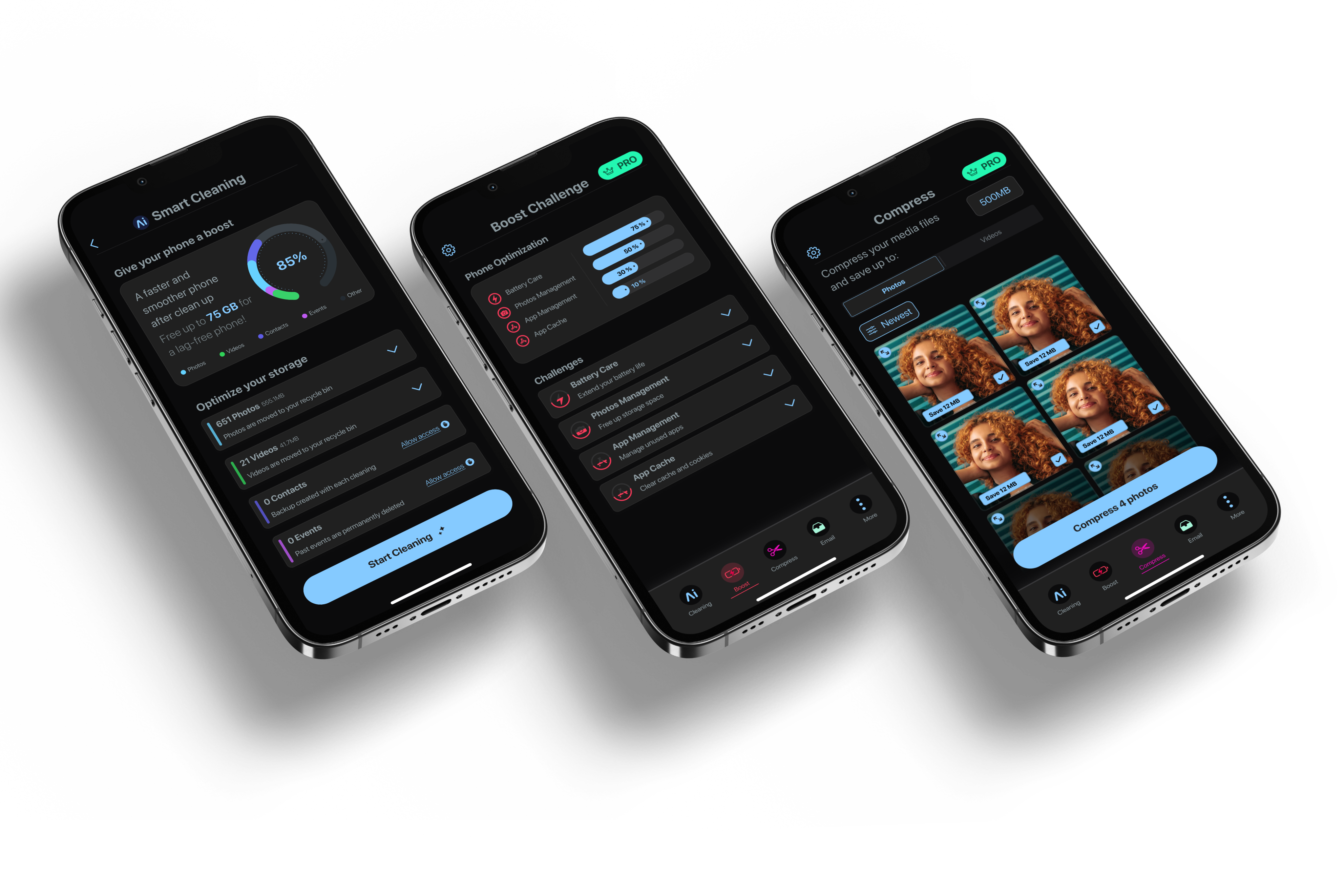
AI Cleaner app screens: Smart Cleaning, Boost Challenge and Compress, dark UI

Case Study · Design System · iOS

One design system, two reading directions.

Company
Eyewind
Role
Lead Product Designer (sole designer)
Scope
iOS App · US + Arabic-speaking countries
Tools
Figma Variables · RTL Language plugin · Figma AI
Scroll
01

An app for two reading directions, one designer.

AI Cleaner is an iOS app that helps people free up storage on their phone. It launched in the US and in Arabic-speaking countries, so every screen had to work in two reading directions, not just two languages.

I was the only designer and I led design end to end: the design system, the app layouts, the wireframes for each feature, the branding, and the technical solution for RTL. I worked with the product managers and the iOS developers. The developers who reviewed the Arabic version were Arabic speakers themselves, so they checked the RTL variants directly.
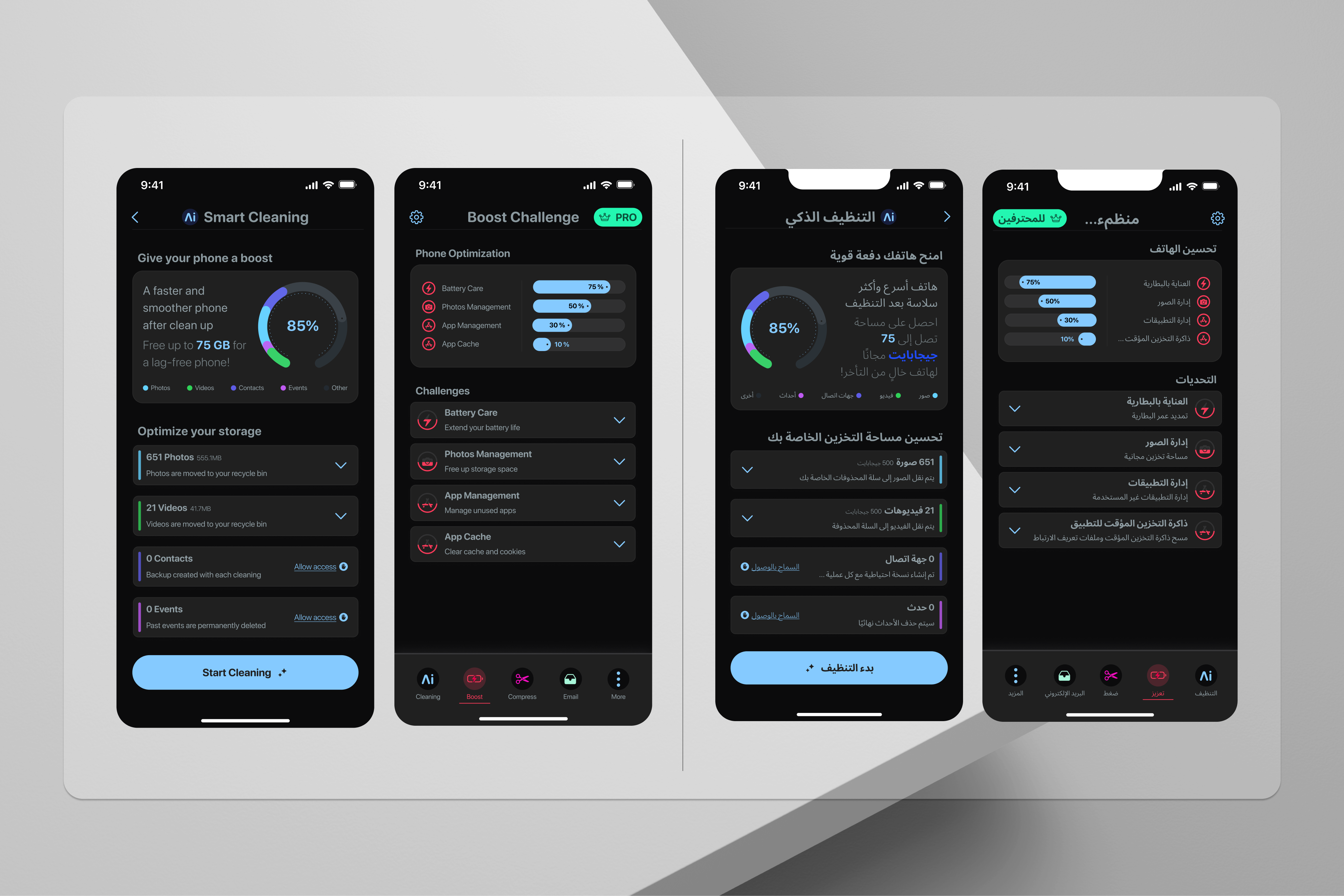
Smart Cleaning and Boost Challenge screens, English (LTR) next to Arabic (RTL)
The same two screens in English and Arabic, side by side.
Role
Lead Product Designer
Sole designer, end to end
Markets
US + Arabic-speaking countries
LTR and RTL, one system
Scope
DS, app layouts, wireframes, branding
Plus the RTL technical approach
Timeline
12 months
From a basic UI kit to 213 components
213

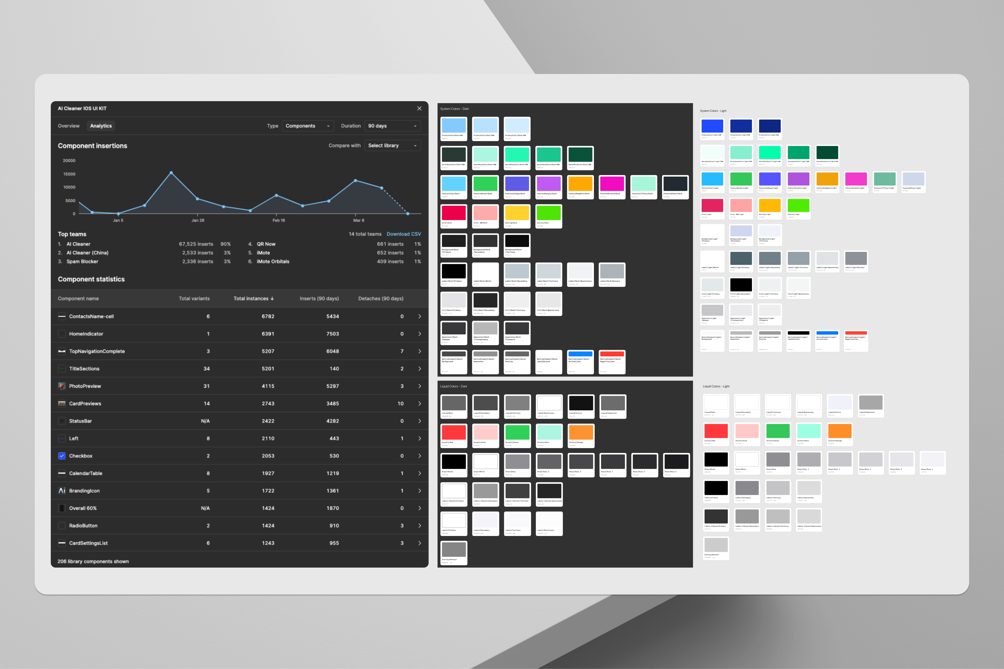
components in one library, built for both LTR and right-to-left Arabic.

Figma library panel · AI Cleaner iOS UI Kit

The real problem

"Mirroring the screen isn't enough. In Arabic, text length reshapes the layout, and some icons change meaning by direction, not just position."

The app had to feel native in two reading directions. Text length changes the layout, Arabic and Latin brand names share the same line, navigation arrows and icons flip, and some icons change orientation entirely, like PLAY and VOLUME. Branding elements are the one thing that never mirrors.

02

One component library, not two.

Every component with text or navigation has an RTL = True/False property. I built the variants by hand with help from the RTL Language plugin, which mirrors the component, translates the text into Arabic, and creates the variant inside the same component.

01

RTL as a variant inside each component, not as a separate mode

I chose variants over Variable modes because the system was scaling up from a simple UI kit and I wanted to move fast. I also considered designing the Arabic layouts separately, without RTL variants inside the components, and discarded that: I wanted every component in one place, as a single source of truth, not two libraries that could drift apart.

The trade-off: maintaining the variants by hand costs more than an automated mode would. In return, I can see in one place, in the same component, exactly how it's assembled in both directions.
02

Tokens are shared, direction lives in the components

One Variables collection holds colors, spacing, typography and radius, with Light and Dark as modes of the same variables, not separate ones. RTL doesn't touch the tokens at all: it's a component-level property, so both directions draw from the same source of truth for color and spacing.

03

Handoff: both directions, side by side

Developers received an Arabic-specific layout, built with the same components in their RTL variant, right next to the LTR layout, so they could compare both versions directly rather than reconstructing the Arabic layout from specs alone.

AI Cleaner token collection: System and Liquid colors, Light and Dark modes
Color tokens: System and Liquid sets, each with Light and Dark modes. Primitives and semantic roles live in a single collection, shared by both reading directions.
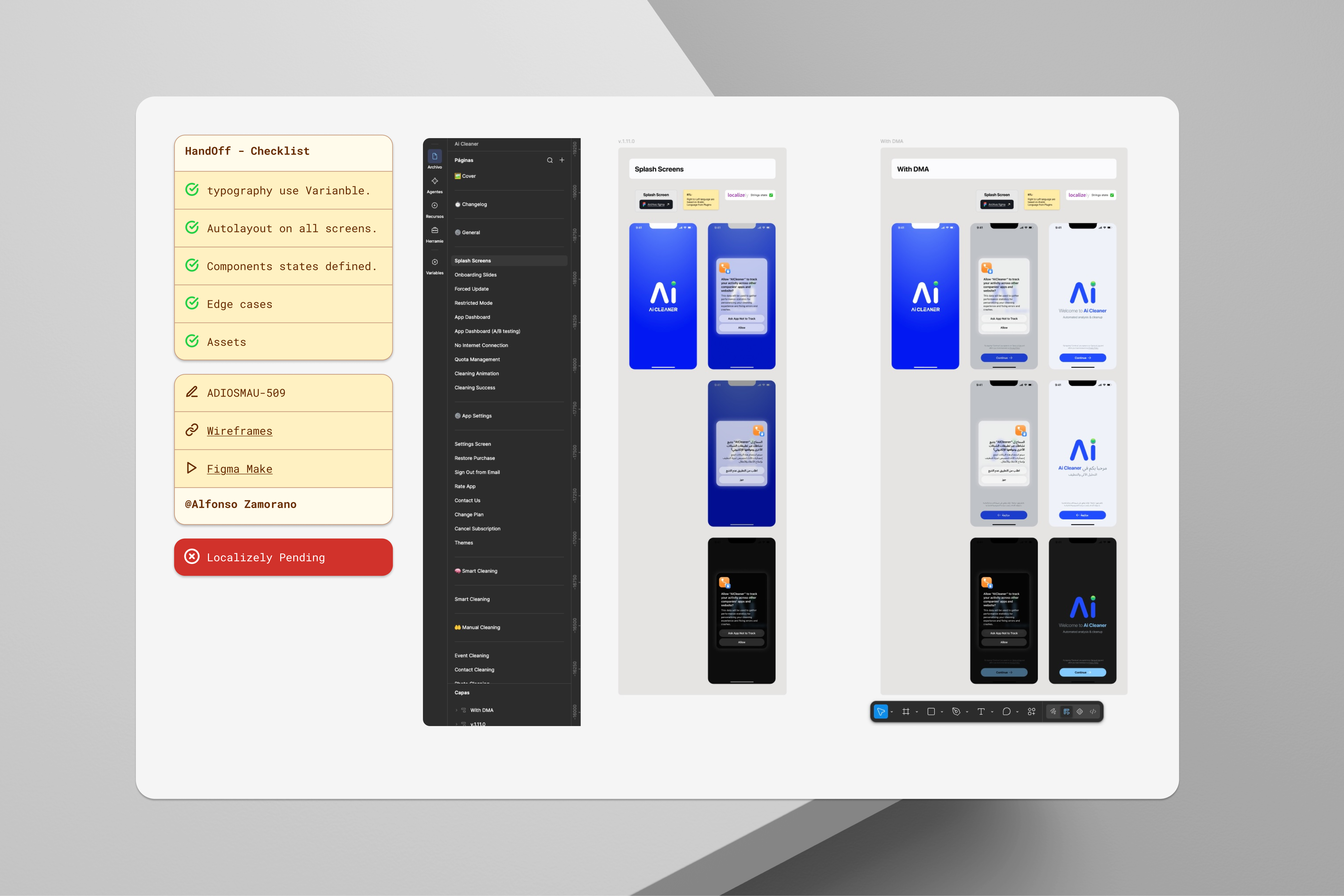
Handoff checklist and Splash Screens compared in English and Arabic
Handoff checklist, and the Splash Screens layout handed off in both directions, side by side.
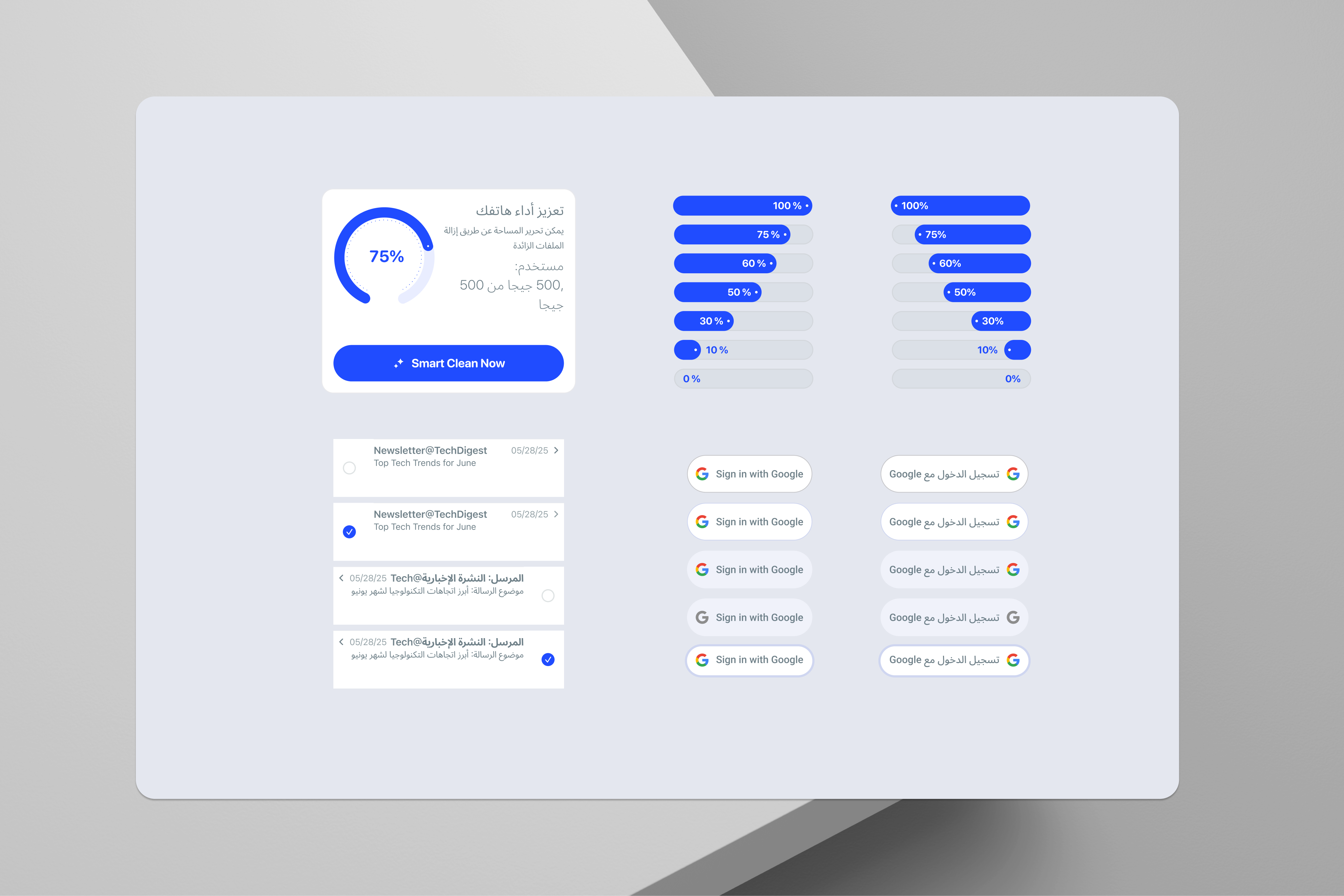
Components compared in English and Arabic: storage gauge, progress bars, Sign in with Google
More components in both directions: the storage gauge, progress bars, and the Sign in with Google button.
03

Anatomy of a component: Button Google.

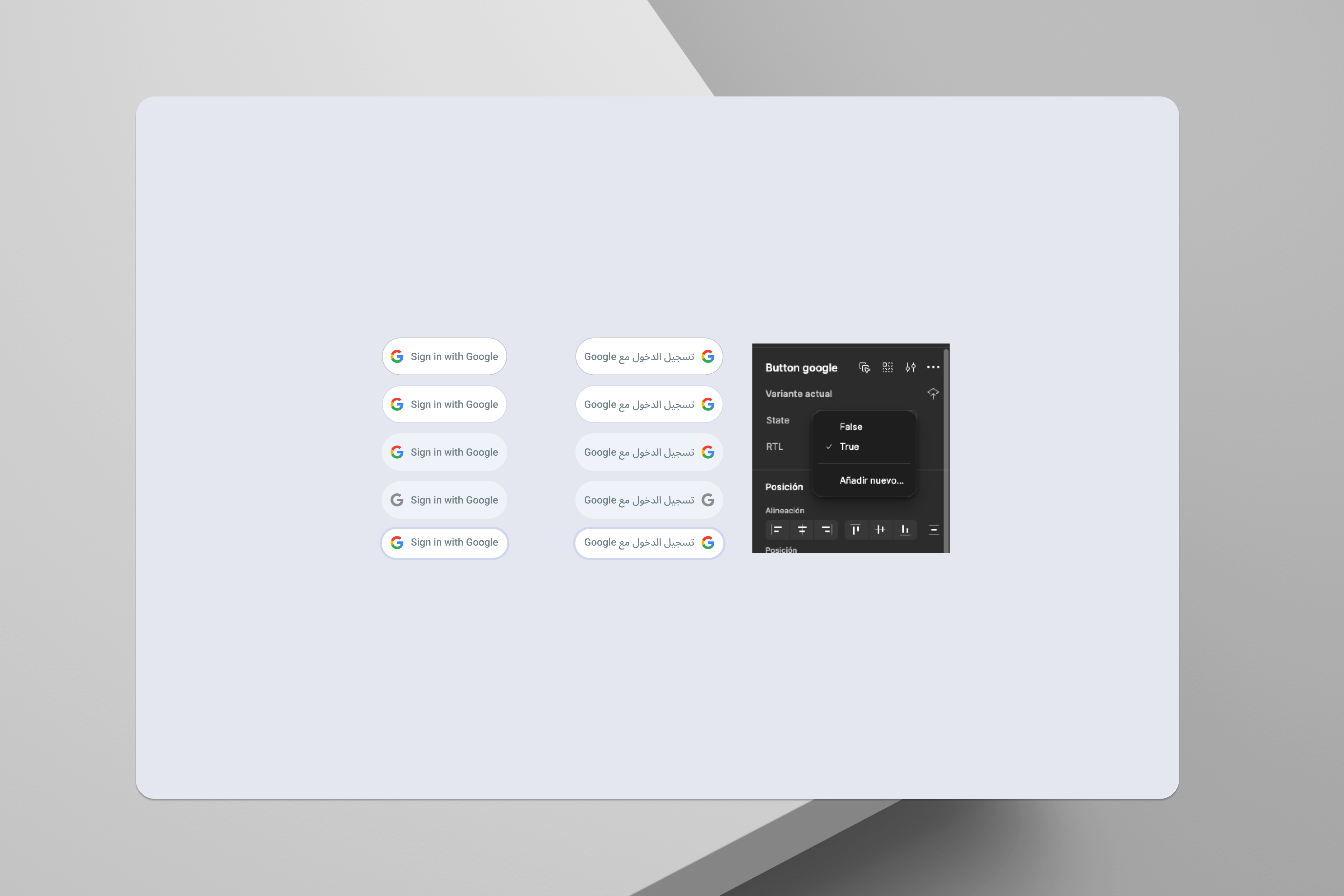
Five states, normal, hover, pressed, disable, and focus, each with an LTR and an RTL variant inside the same component. It's a small component that shows what RTL actually requires.

Button Google component matrix: 5 states in LTR on the left, 5 states in RTL on the right
10 variants in one component: 5 states × LTR/RTL. Figma · AI Cleaner iOS UI Kit
Mirrors

The icon position and the text alignment flip. Navigation arrows and directional icons follow the same rule everywhere in the system.

Adapts

The width changes, 179px → 208px, because the Arabic text is longer, not because of a design decision. Auto Layout handles it. The Latin brand name "Google" stays inside the same line as the Arabic text.

Stays the same

The radius (Pill, 100) and the color variables, Background/Primary, Background/Secondary, Separator/Opaque, Label/Secondary, are identical in both directions.

04

213 components, one token collection.

Almost every component that has text or navigation elements carries an RTL variant. Icon orientation is part of the same system: PLAY and VOLUME change orientation by direction, the way an arrow does.

Figma · Variables
One token collection
Colors in four sets (System/Liquid × Light/Dark), plus spacing (e.g. Spacing_01 = 8px), typography and radius tokens. Primitives and semantic roles share one collection.
→
Figma · Auto Layout + RTL Language
213 components, LTR + RTL
Auto Layout components with an RTL property. The plugin mirrors, translates and builds the RTL variant inside the same component.
→
Figma AI · Annotation
Handoff, side by side
Specs and annotations made with Figma AI. Developers got the Arabic layout next to the LTR layout, built from the same components, to compare directly.
WCAG AA · Color contrast

Every color pairing in the token collection, Background against Label, across all four sets (System/Liquid × Light/Dark) and both reading directions, was checked for contrast with Stark in Figma. Checking at the token level meant one pass per semantic pairing, not one per instance across 213 components.

05

Governance was a conversation, not a queue.

With one designer and a product trio, governance had to be lightweight and direct rather than a formal review process.

Product trio
New components
Decided in a meeting of the product trio, stakeholders, design and developers, rather than a separate design-system review.
Figma branching
Versioning
Changes to the library were versioned using Figma's own branching, rather than a separate changelog or release process.
Maze / Figma Make
RTL usability testing
After each milestone, we ran usability tests with the group of Arabic-speaking developers, mostly on a prototype in Maze or Figma Make.
Native review
Language and layout QA
The developers who reviewed the Arabic version were Arabic speakers, so they checked the plugin's translation and the RTL layout directly. I reviewed the plugin's output myself as well.
06

Results.

+30%
Faster design-to-dev delivery
Judged by ticket flow in our sprints after the system shipped, against the baseline before it.
4.6★
App Store rating
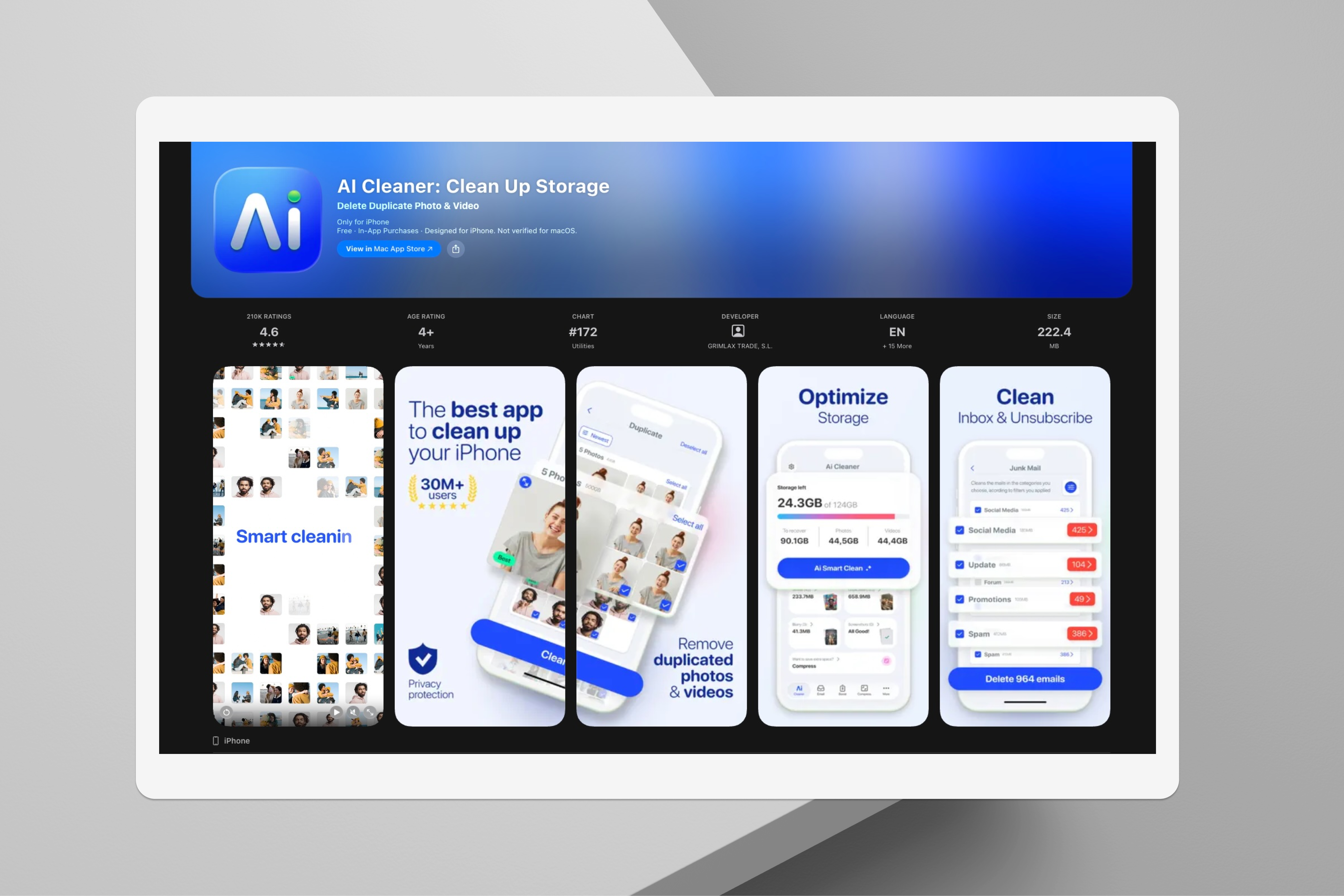
210K ratings in the US market, #172 in the Utilities category (App Store, checked Sep 2026).
213
Components, one library
Auto Layout components, almost all with an RTL variant, built and maintained by one designer.
AI Cleaner App Store listing, US store: 4.6 stars, 210K ratings, #172 in Utilities
App Store listing, US store · checked September 2026
07

What I'd do differently.

01

Document the system properly, not just in Figma

I relied on Figma annotations for handoff, and it worked, but it meant the reasoning behind decisions lived in my head more than in the file. I'd document the system properly from the start: not just what a component is, but why it exists and when to use it.

02

Maintaining RTL variants by hand costs more than it should

Building the RTL variants by hand, with the plugin's help, costs more to maintain than an automated approach would. In return, I could see in one place how components and layouts were assembled in both directions, which mattered while the system was still taking shape. At this scale, I'd look again at Variable modes for direction.

08

Toward an agentic design system: Aida.

AI Cleaner taught me how to make one system hold two reading directions without splitting into two products. Aida is my own research project, asking the next question: what does a design system need so that people and AI agents can both use it, without the agent inventing a component that already exists?

Layer 1
Component metadata
Props, tokens, when to use it, accessibility notes, and a link back to the Figma source.
Layer 2
Generated index
A machine-readable index of every component, kept in sync with the metadata.
Layer 3
Protocol for agents
A CLAUDE.md file that tells an agent to extend an existing component before creating a new one, with a checklist, an ARC working cycle, and a flags log.
Layer 4
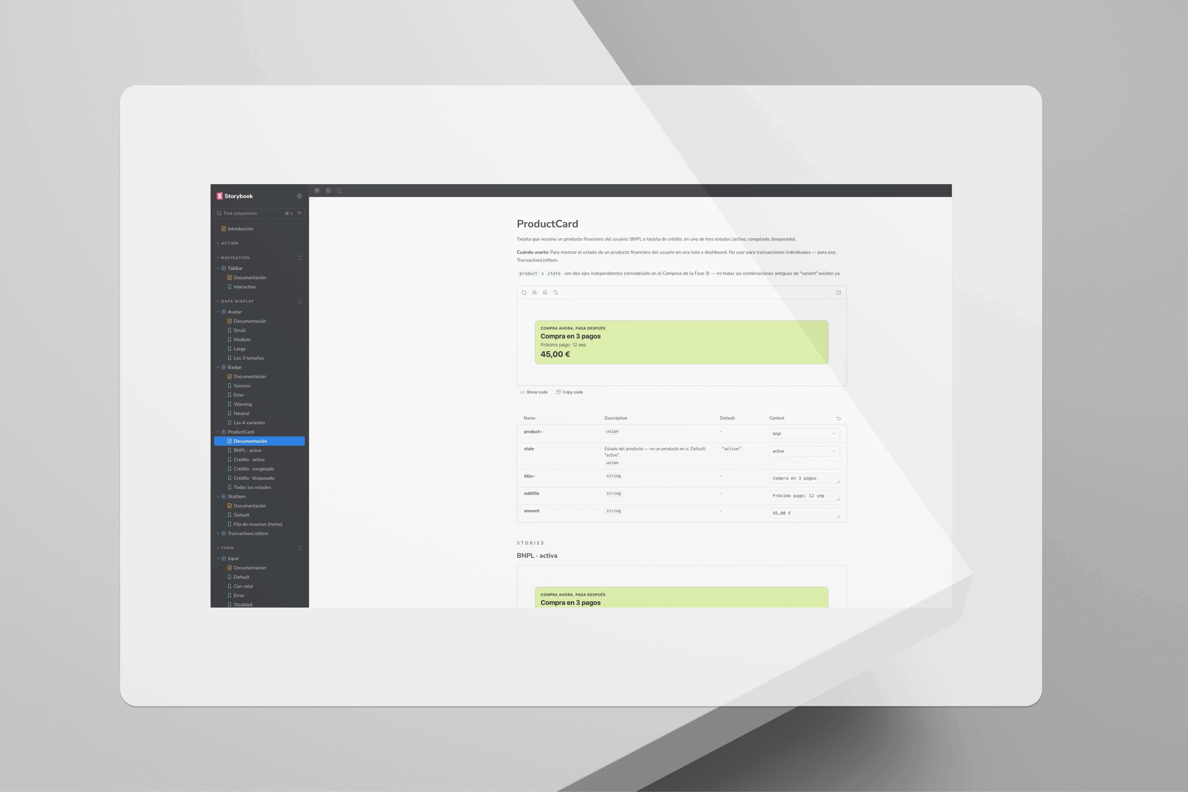
Storybook
A public showcase that consumes the same metadata people and agents both read from.

Where it stands: phases 0 to 3 are done, phase 4 is in progress, with 11 components live today. It's a solo research project, and it doesn't have impact metrics yet, this is early, honest work in progress, not a finished system.

Aida Storybook: ProductCard component documentation, props table and usage notes
Aida's Storybook: component docs written for people and agents to read.

At AI Cleaner I made two reading directions live in one system. With Aida I'm asking the next question: what does a design system need so that an agent can extend it without inventing?

← All case studies