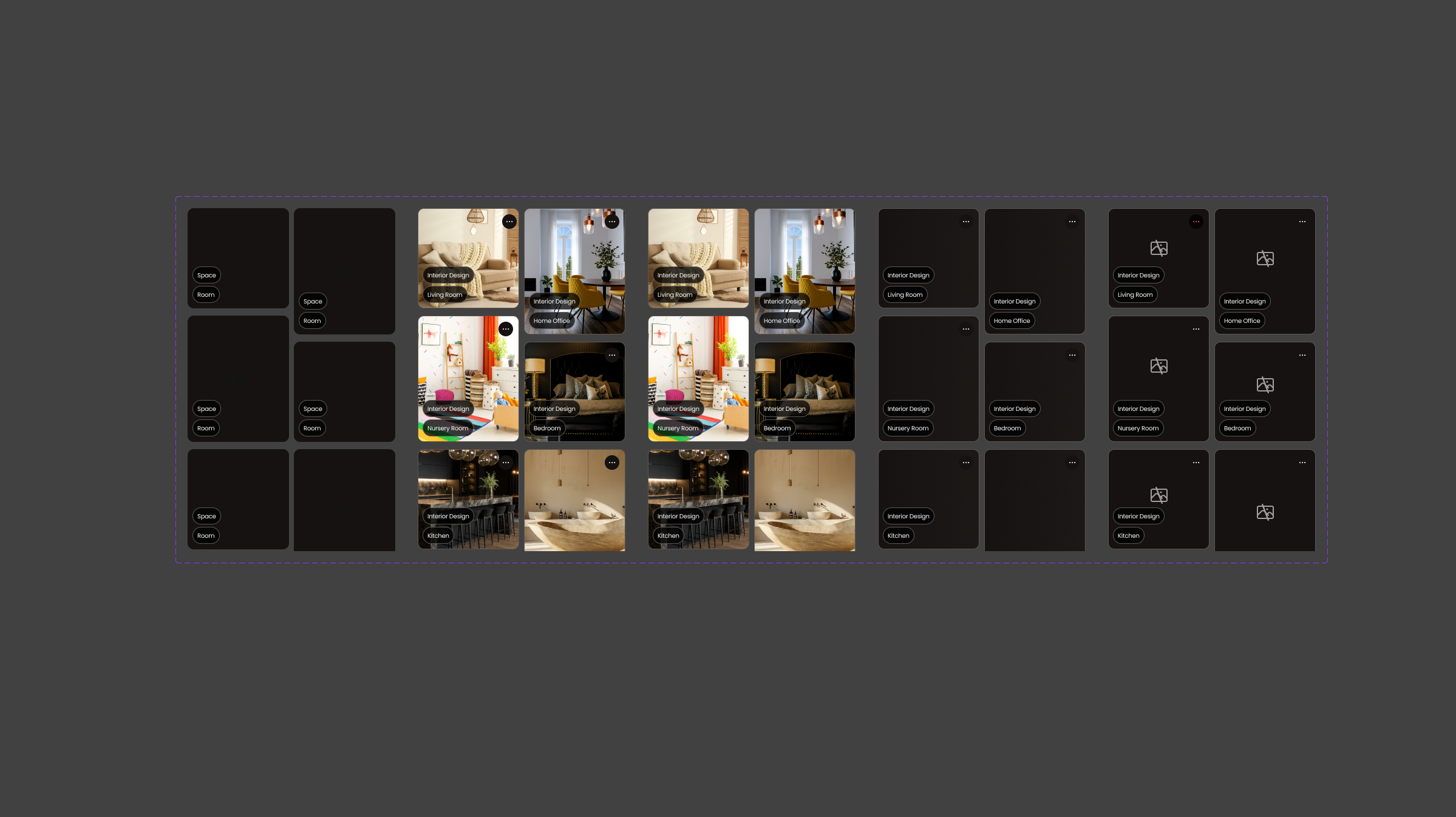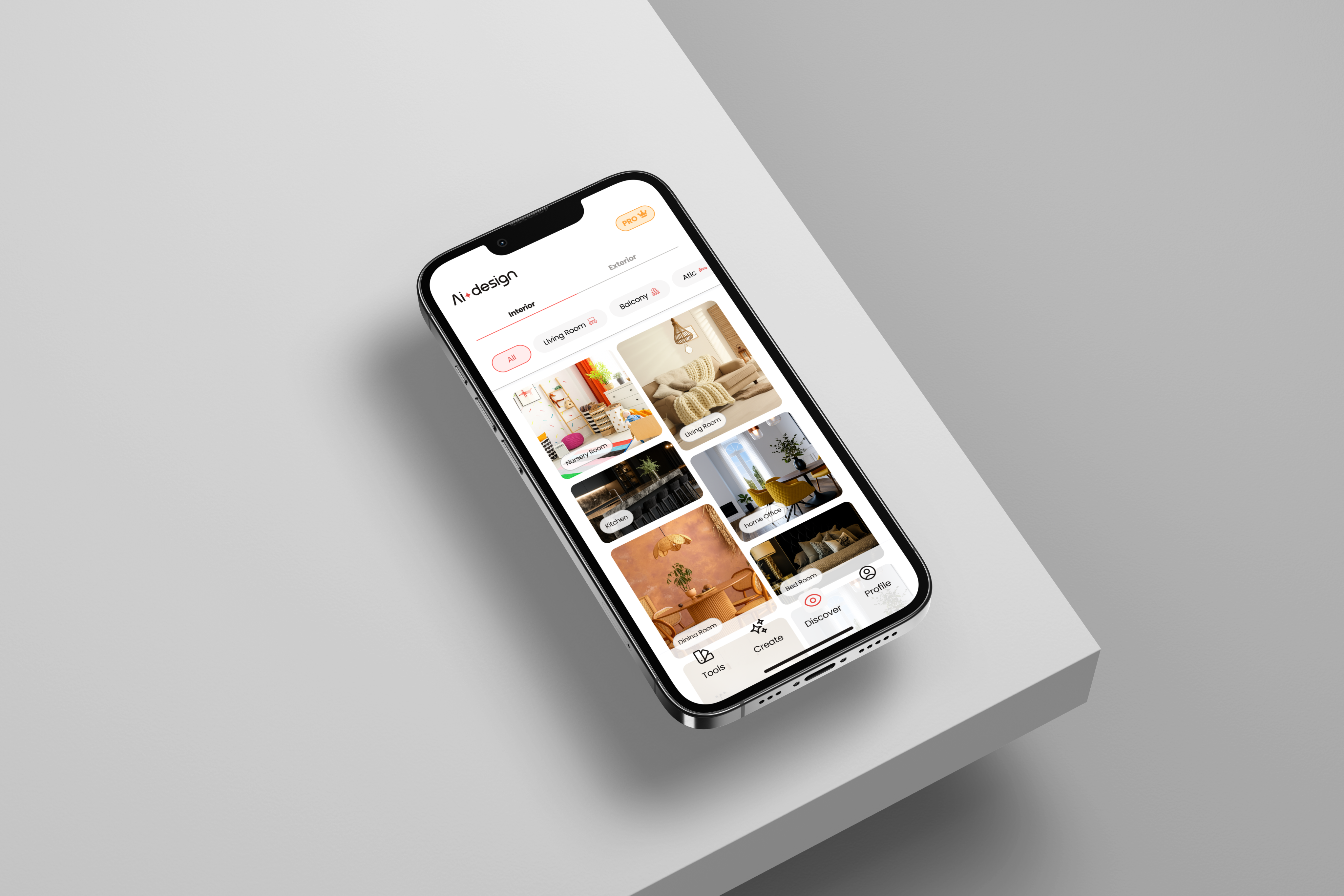
AI Design app: room transformation interface
Case Study · Lead Product Designer

AI Design: Reimagining Spaces with a Single Photo

Company
AI Design App
Scope
iOS App · B2C
Type
Generative AI · Computer Vision
Tools
Figma · Amplitude · Maze · Runway
Scroll
01

Everyone has a vision for their home.

A color they've been meaning to try, a style they've saved a hundred times on Pinterest, a room they know could feel completely different. The vision is there. The problem is the gap between that vision and reality, the inability to see how a space will actually look before spending thousands on furniture, paint, and renovation.


That gap has a name. We called it Renovation Paralysis.


Our research confirmed what we suspected: 73% of users wanted to redecorate, but felt blocked. Not by lack of inspiration, they had plenty of that. Blocked by the fear of making an expensive mistake. So they stayed stuck, scrolling, saving, never deciding.
73%

of users wanted to redecorate their home, but felt blocked by the fear of making an expensive mistake.

Survey · n=340 users · pre-MVP research
The insight that changed everything
"This wasn't a decoration tool.
It was a confidence tool."

When I joined this project as Lead Product Designer, the brief was to build a decoration tool. But the data told a different story. This wasn't a decoration problem, it was a confidence problem. And that reframe changed every design decision that followed.

02

My role and the north star.

I was the sole designer on a cross-functional team of 6: 1 PM, 1 PO, 1 Dev Lead and 2 developers. I owned the design end-to-end, from research and facilitation to design system and handoff.

Role
Lead Product Designer
Sole designer on the team
North star metric
Time to first redesign
Every decision evaluated against this
Platform
iOS + Android
Developed in parallel
Timeline
MVP → 90 days post-launch
Measured impact window
03

The process, before a single screen was designed.

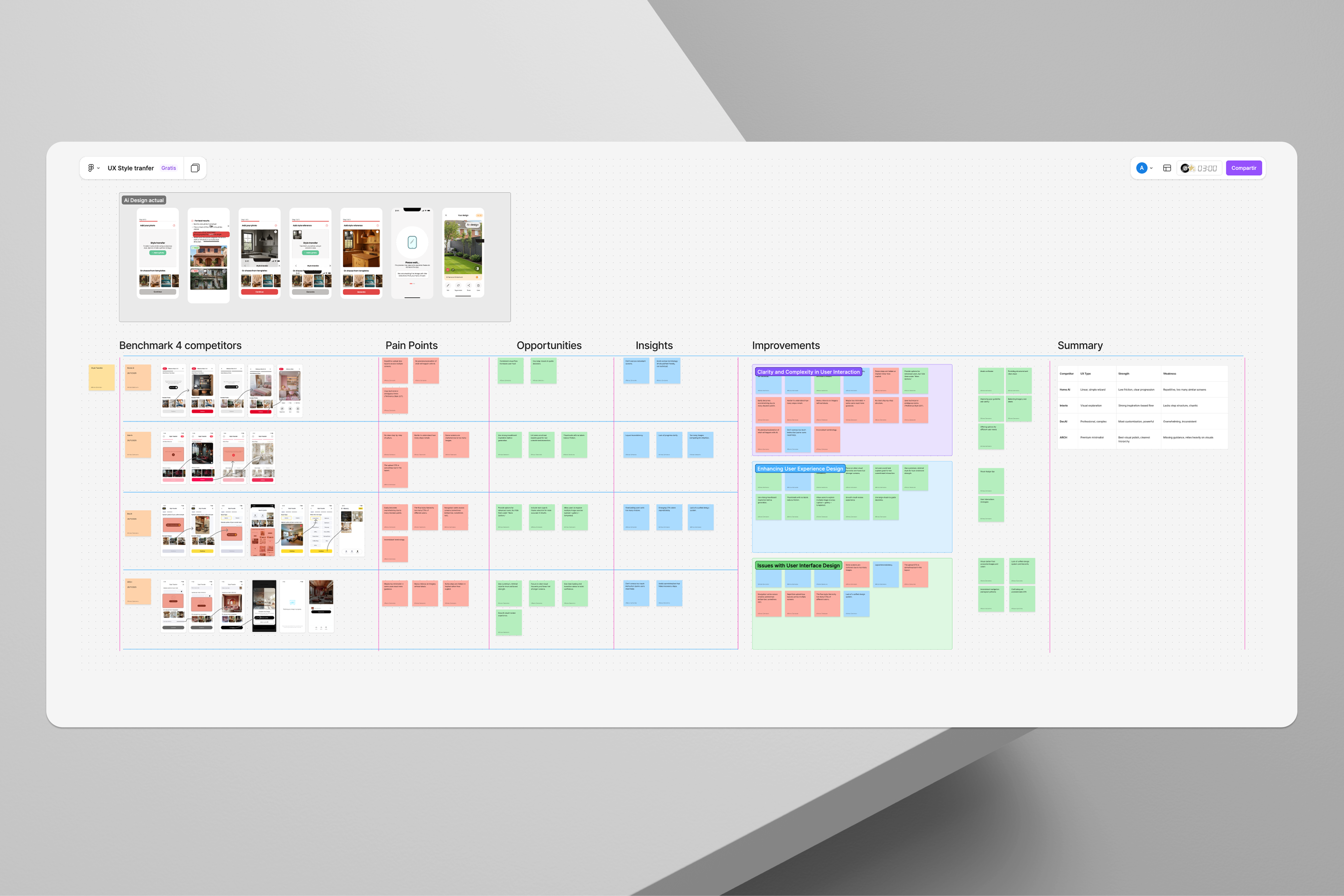
Before opening Figma, we ran a structured series of collaborative workshops with all stakeholders. The goal was to align everyone on what mattered, and surface the north star collectively, not impose it top-down.

WS 01

Co-creation workshops

Joint sessions with PM, PO and business stakeholders to align vision, identify opportunities and prioritise from day zero. Everyone had a voice in defining the product before a single screen existed, avoiding costly direction changes in later phases.

Facilitated
WS 02

User persona workshops

Collaborative construction of user personas with the full team. We defined who the real user was, not the imagined one, their motivations, blockers and behaviours around home decoration. These profiles directly informed design decisions, from onboarding tone to the selection of the 12 styles in the Style Library.

Facilitated
WS 03

MoSCoW prioritisation

With all stakeholders (PM, PO, Dev Lead, business), we ran a MoSCoW workshop to define what entered the MVP and what didn't. This was the framework that resolved the tension between the dev team (ship fast) and PM/PO (more features), with an objective, shared framework rather than opinion. What didn't make the Must Have or Should Have was documented and moved to the Q1 roadmap.

Conflict resolution
WS 04

North star metric workshop

In the pre-MVP workshops, the team collectively identified the need for a single guiding metric. The result was time to first redesign: the time from app open to first AI-generated room transformation. It wasn't imposed, it emerged from the process. That guaranteed PM, devs and design evaluated every decision against the same criterion.

Emerged collaboratively
Workshop artifacts: user persona outputs and MoSCoW board

From the workshops, we moved into quantitative research. A survey of 340 users confirmed and sharpened the problem. 73% had abandoned a redecoration project due to fear of making costly mistakes. The insight didn't just validate the problem, it reframed the entire product strategy.

04

Compressing 11 steps into 3.

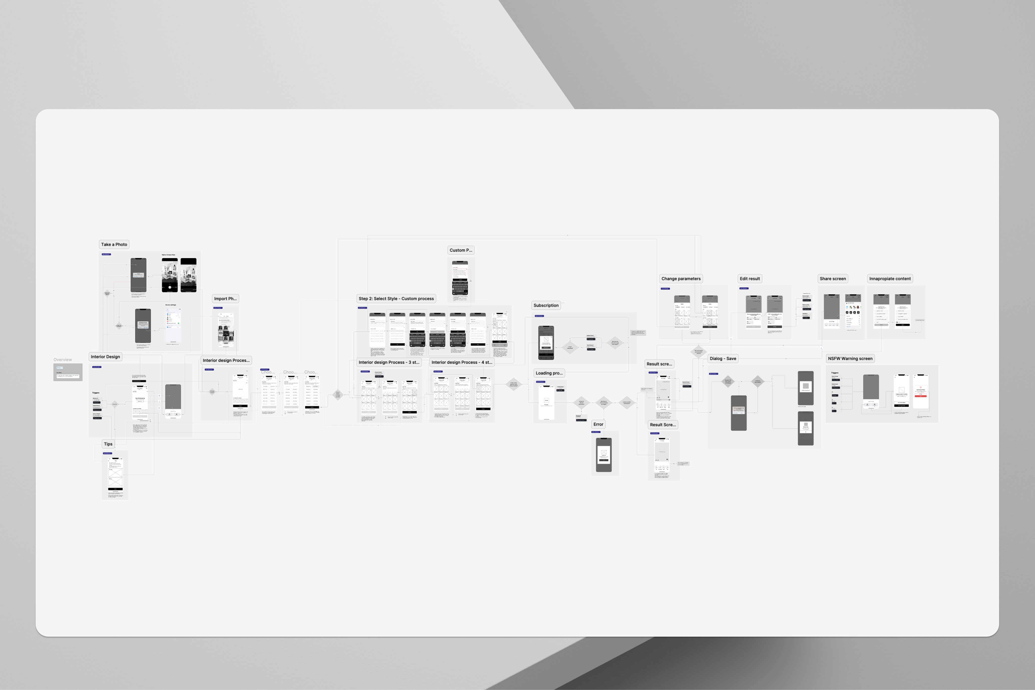
The original flow had 11 steps. Between photo capture, style selection, AI parameter configuration, manual room masking, render adjustments and result review, the journey was so long that most users dropped off before seeing a single result. The first prototype took 34 seconds. Unacceptable for a B2C mobile product.

Original flow: 11 steps
01 Open app
02 Onboarding
03 Grant permissions
04 Capture photo
05 Manual masking
06 Select style
07 Set AI params
08 Render (34s)
09 Review result
10 Edit
11 Save / share
New flow: 3 steps → 8.3 seconds
01
Photo Capture
Single tap. No masking. ControlNet handles room detection automatically.
→
02
Style Picker
12 curated styles validated with 200+ users via Maze. Before/After visible on each card.
→
03
AI Result
Generated in under 8.3s. Active loading feedback, not a blank screen.
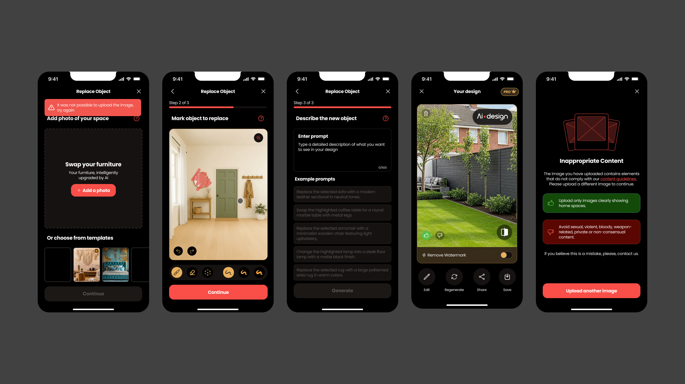
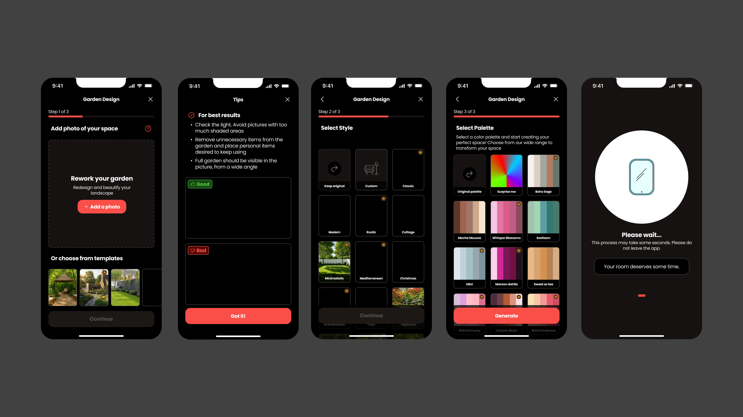
Core flow screens: Photo Capture, Style Picker and AI Result
05

Three decisions that shaped the product.

01

Automate the masking: hide the complexity

The original flow required users to manually mask their room before the AI could process it. This was technically necessary but UX-catastrophic for a B2C audience.

Decision: moved room masking entirely into the ControlNet pipeline. The user never sees it. One tap, done. This single change removed 4 steps from the flow.
02

Wow first, controls second

The granular editing layer (wall colour picker, furniture swap by category, lighting tone) existed in v1 as part of the primary flow. It was overwhelming users before they'd experienced any value.

Decision: moved all editing controls to a secondary layer. Available, but not required. Users reach the wow moment first, then explore customisation at their own pace.
03

A roadmap instead of an argument

Competitors had more features in their MVPs. The dev team wanted to ship fast. PM/PO wanted more features before launch. As the sole designer at the centre of this tension, I needed more than an opinion.

Decision: built a Q1 post-launch roadmap showing exactly when each competitor feature would arrive. It gave stakeholders certainty, devs permission to ship, and business the visibility to plan CRO campaigns. The roadmap unlocked the agreement, not a debate.
06

A design system built to outlast the project.

90+ components. Built from zero. The goal wasn't just consistency, it was making sure the knowledge didn't disappear when a sprint ended or a team member moved on.

Figma
UI Kit with variables
Components built with Figma variables for instant theme switching. Enabled consistency across iOS and Android simultaneously.
→
Zeroheight
Living documentation
Every component published with corresponding code generated with Claude. Devs had direct access to specs and code, zero ambiguity in handoff.
→
Notebook LLM
Shared knowledge base
All documentation shared with devs via Notebook LLM. Knowledge doesn't depend on a single person, any team member can query and use the code at any time.
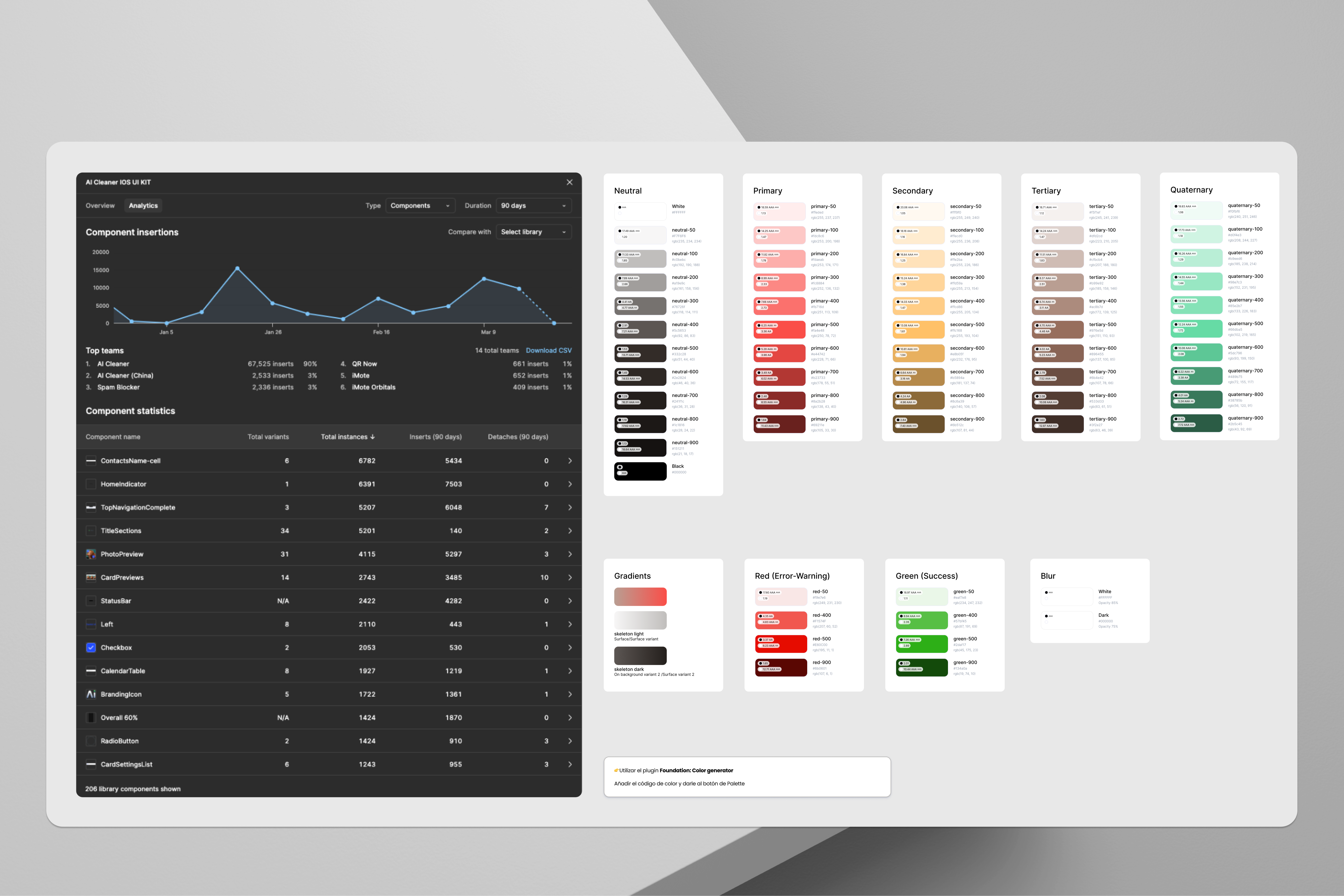
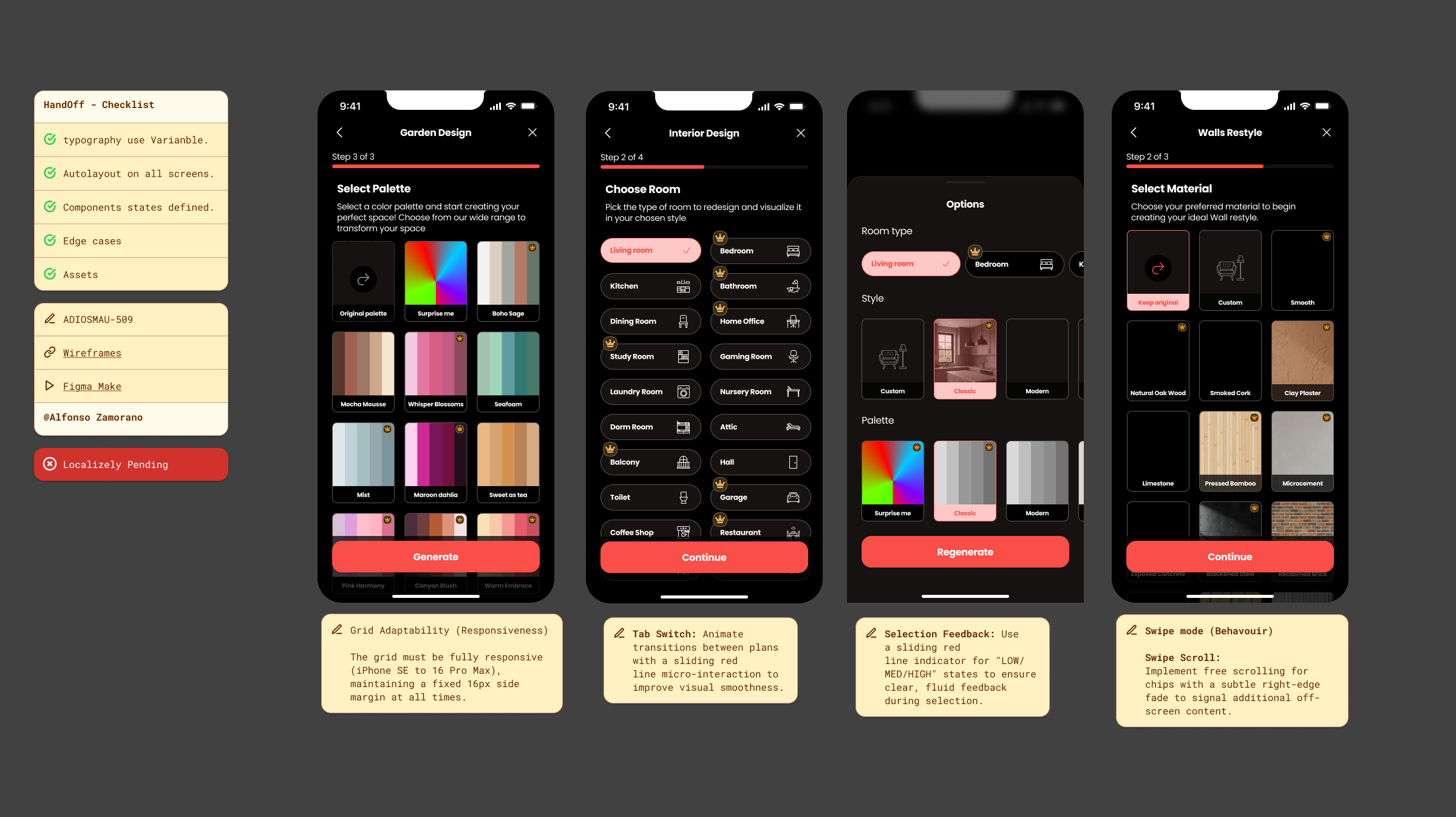
Design system overview: 90+ components from Figma and Zeroheight
07

What testing changed.

Validation wasn't a checkbox at the end of the process, it was what shaped the final decisions. Two findings directly changed the product.

Maze · n=200+ users
Style Library validation
Each of the 12 interior styles was tested for instant recognition and desirability. Only styles with high recognition and desirability scores made it into the product.
Usability Testing
Two things that changed
Full flow testing surfaced two clear issues.
Paint was redundant with Wall Paint. Removed to eliminate confusion.
Home cards didn't show Before/After. Users didn't understand the core value proposition. Redesigned cards and Home to make the transformation immediately visible.
A/B Testing
Pricing pages
Plans and copy were tested from launch to optimise conversion. Results fed continuous iterations on pricing pages through Q1.
Amplitude · Hotjar
Behavioural data
Session tracking and heatmaps used throughout to identify friction points in the flow and validate improvements after each release.
Core flow: Photo Capture, Style Picker and AI Result
Core flow across three screens — Photo Capture, Style Picker, and the AI-generated result. The full journey was compressed from 11 steps to 3.
User research findings: renovation paralysis survey data
Survey data from 340 users — 73% reported abandoning a redecoration project due to fear of making expensive mistakes. This insight reframed our entire product strategy.
Before and after: same room in Minimalist and Scandinavian styles
Before / after comparison — the same living room rendered in Minimalist and Scandinavian styles. Generated in under 9 seconds on a standard iPhone 14.
AI Design component library: full design system overview
AI Design System — 90+ components including the Style Card, Before/After slider, Room Snapshot, and Colour Picker — all built with Figma variables for instant theme switching.
08

Results: 90 days post-launch.

+68%
Purchase confidence
Users who visualised a redesign before buying reported significantly higher purchase confidence, validated through post-session surveys with retailer partners.
8.3s
Time to first redesign
From photo capture to AI-generated result. Every design decision was evaluated against this north star metric.
34s prototype v1 → 8.3s shipped
4.7★
App Store rating
Achieved in the first 90 days, ranking in the top 50 of the Lifestyle category across 12 markets.
4.2×
Sessions per week
Weekly return rate, users came back to explore different styles across multiple rooms, driving strong organic growth.
09

What I'd do differently.

01

The onboarding was a missed opportunity

We based the onboarding on competitive benchmarking, we replicated what competitors were doing without questioning it enough. In retrospect, there was a real opportunity for differentiation. Onboarding is the first moment a user forms their perception of the product, and ours could have reinforced the "confidence tool" positioning much more strongly instead of replicating what already existed.

02

The next frontier is planning, not just visualising

The MVP validated the visualisation concept. But the bigger opportunity is converting the app into a full renovation planning tool: AI-generated floor plans, cost estimation, material selection. That vision was visible from the start, but required the foundation the MVP built first.

Within 90 days, the app had become a daily habit. Users weren't opening it once, they were coming back 4.2 times a week, exploring different styles, different rooms, different possibilities.

The paralysis had broken. +68% purchase confidence was the proof we'd solved the right problem. Not decoration. Confidence.

← All case studies