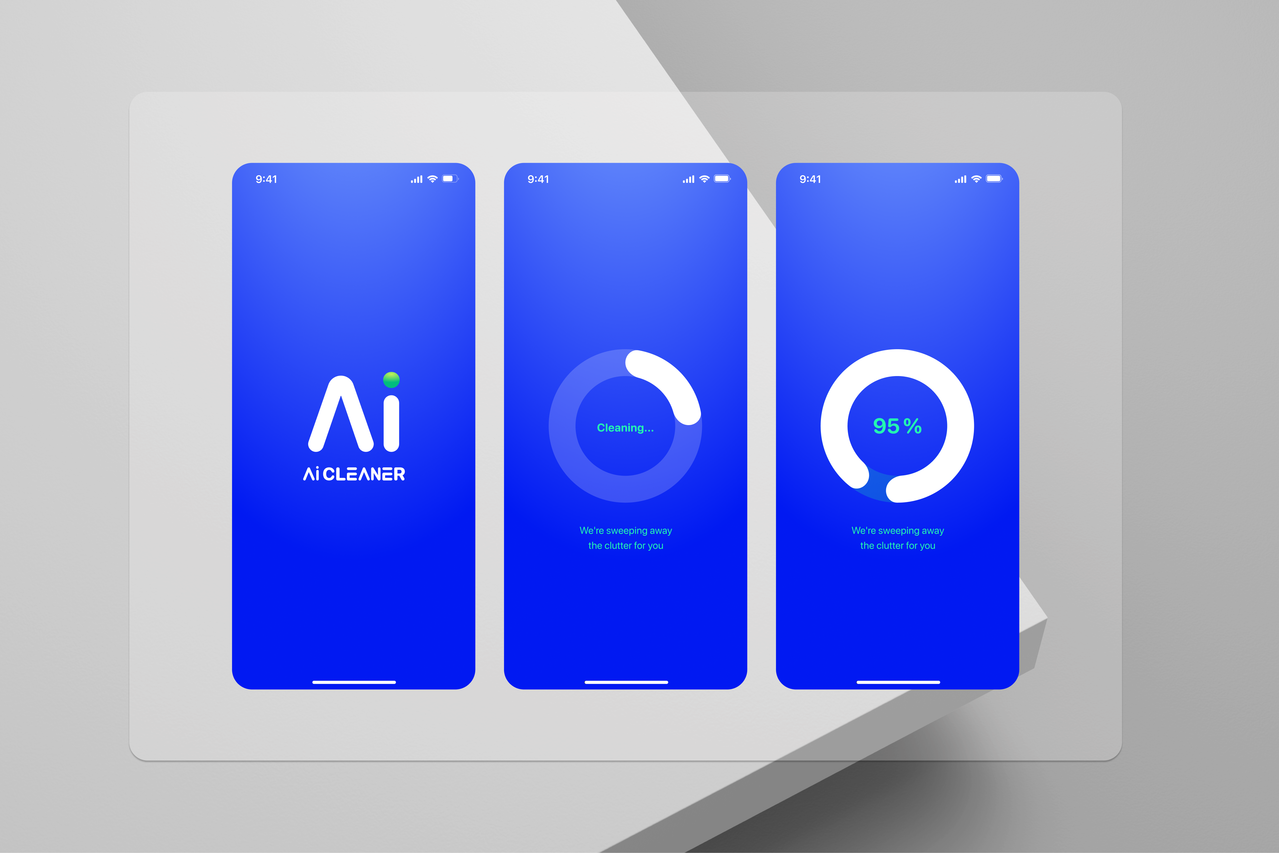
Case Study · iOS · 2024

AI Cleaner: from a 67% drop-off to a top 10 Utilities launch.

Company
Leadtech Group
Role
Lead Product Designer
Scope
iOS App · US + Arabic countries
Tools
Figma AI · Amplitude · Synthetic Users
Scroll
01

The app was good. The first 60 seconds were not.

AI Cleaner had a clear value proposition: scan your iPhone, identify duplicates, screenshots, and junk files, and recover storage in seconds. The problem was that users were never getting there. They downloaded the app, opened it, hit the permissions screen, and left.

Amplitude told us the exact number: 67% of users abandoned at the photo library permissions request, before they had seen a single feature. We had built a product that worked, but an entry experience that didn't earn the trust required to use it.

The product challenge wasn't the AI, the scan speed, or the storage math. It was a trust problem at the very first moment of the relationship.

At a glance 67% drop-off at the permissions screen · 31% → under 8% secondary drop-off · 2.1× permissions grant rate · 340MB → 2.5GB avg. storage recovered per first session · 4.6★ from 210K ratings, top 10 Utilities at launch

Why this mattered beyond the screen: every abandoned session at the permissions screen was an install we'd already paid for or earned through App Store ranking, churning before it ever saw the product work. This wasn't a UI polish problem, it was acquisition spend and organic ranking momentum leaking out on day zero.

67%

of users abandoned at the photo permissions screen, before seeing the app.

Amplitude cohort analysis · iOS activation funnel · 2023 baseline

The real problem

"The problem wasn't that users didn't want to clean their phone. It was that we were asking them to hand over access to every photo they'd ever taken before we'd given them a single reason to trust us."

That reframe changed everything. Once we stopped treating onboarding as a setup flow and started treating it as a trust-building sequence, the right decisions became obvious: show value first, ask for access second. The permissions screen wasn't the problem, the order was.

02

My role: design lead across two markets.

I joined as Lead Product Designer with ownership across the full product experience: onboarding, core scan flow, design system, and the Arabic-market variant. The team was small but fast, and the brief was clear: fix activation, then scale globally.

The north star wasn't downloads. It was the number of users who completed a scan and recovered storage on their first session. Everything we designed had to move that number.

Cross-functional alignment: ran structured working sessions with PM, iOS engineering and the data analyst to keep funnel diagnosis and trade-offs visible to the whole team before any screen was built, not formal facilitated workshops, but the same job: get the room aligned on the problem before committing to a solution.

North Star
First-session scan completion
Users who scan and recover on session 1
My Role
Lead Product Designer
Onboarding, core flow, DS, Arabic variant
Markets
US + Arabic countries
Two variants, one design system
Team
Sole designer · cross-functional
PM, iOS engineers, data analyst
Timeline
12 months
Discovery through Arabic-market launch
03

Research & Discovery: four weeks to understand two different problems.

Before touching any screens, we needed to understand why activation was failing and what the expansion into Arabic countries would require. We ran a structured discovery sprint: quantitative first, qualitative second, competitive last.

Method mix: funnel analytics, moderated qualitative interviews, competitive benchmarking, synthetic-user validation, strategic synthesis, sequenced to move from "where are they dropping" to "why" to "what to build."

Week 01

Funnel analysis with Amplitude

We mapped every step of the activation funnel and identified the 67% drop-off at permissions. We also found a secondary drop-off: 31% of users who granted permissions still didn't complete a scan. Two problems, not one. The permissions screen was the first; the scan result UX was the second.

Amplitude · Cohort analysis
Week 02

Qualitative research on trust and permission anxiety

We ran 12 moderated sessions with users who had abandoned during onboarding. The pattern was consistent: users weren't opposed to granting access, they were opposed to granting it blind. They wanted to understand what the app would do with their photos before handing them over. The copy and context around the permissions ask was doing no work.

User interviews · Synthetic Users validation
Week 03

Arabic market research: different trust patterns, different density expectations

For the Arabic variant, we ran a benchmarking sprint against the top 10 utility apps on the App Store across Arabic countries. Key differences: higher information density is expected, not overwhelming; local payment methods like Mada and STC Pay are trust anchors, not distractions; social proof (ratings, user counts) needs to appear higher in the flow. The mental model for "a trustworthy app" is structurally different.

Competitive audit · Market benchmarking
Week 04

Synthesis: one product, two activation problems, one design system

The discovery output was a single strategic recommendation: redesign the onboarding trust layer for the US market, and build a Arabic-adapted variant from the same component system rather than a parallel product. Separate products meant separate debt. One token layer, two configurations, meant a team of three could maintain both without doubling the workload.

Strategic synthesis · DesignOps framing
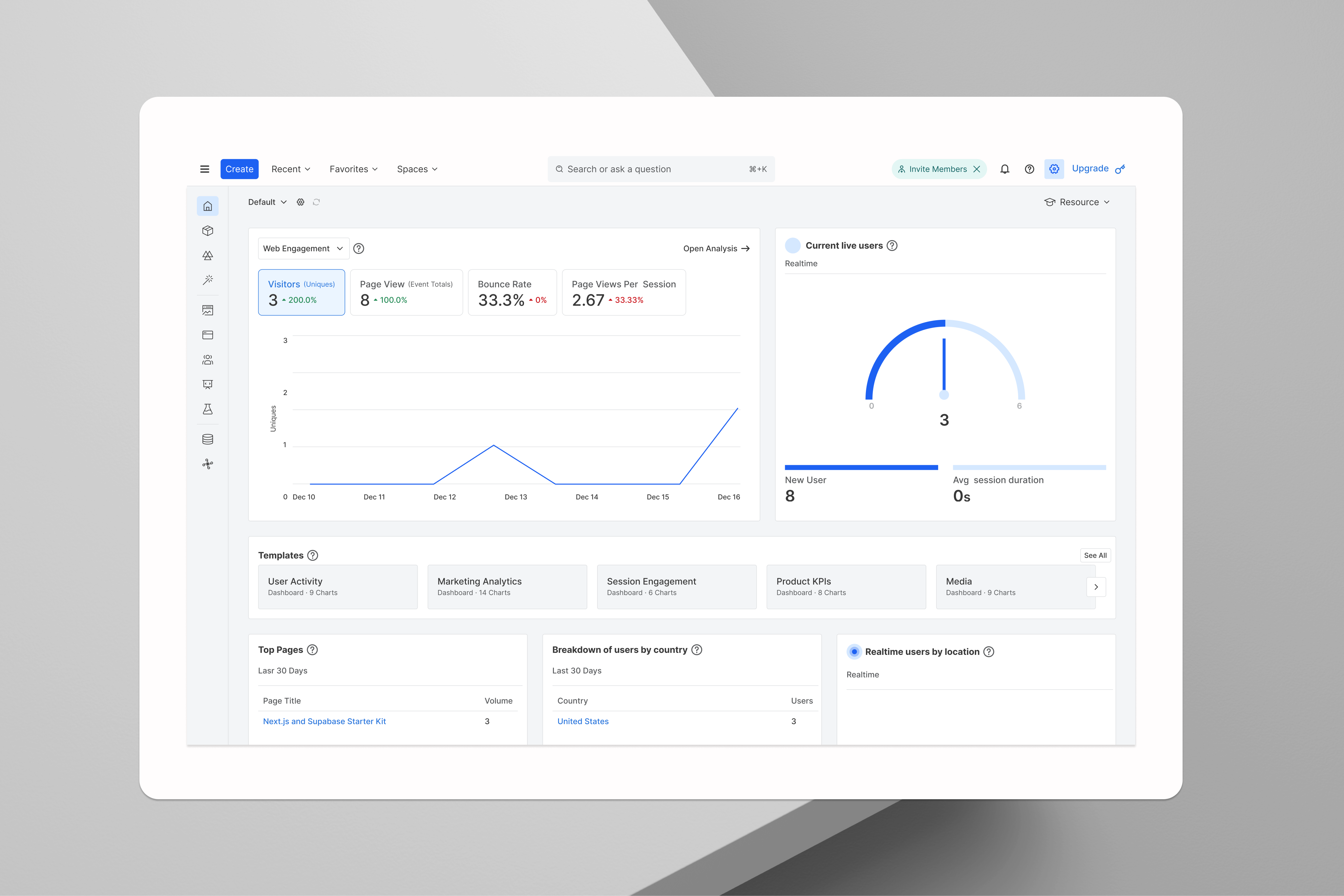
Amplitude funnel analysis showing 67% drop-off at permissions
Amplitude cohort analysis, the permissions screen had a 67% drop-off rate. Two friction points identified: no value shown before the ask, and no context around what the app would do with photo access.
04

Three decisions that changed the trajectory.

Discovery gave us clarity. These are the three strategic decisions we made, and more importantly, why we made them over the obvious alternatives.

Original onboarding: 7 steps before any value

1. Splash 2. Value prop 3. Permissions ask 4. Permissions denied state 5. Scan screen 6. Results 7. Clean CTA

Redesigned: value first, permissions second

Step 01
Demo scan
Show what the app finds, without access
→
Step 02
Contextual permissions ask
Ask at the moment of intent, with clear context
→
Step 03
Real scan + results
Immediate value, one tap to clean
01

Defer the permissions ask until after demonstrated value

Business rationale: a permissions denial doesn't just lose a session, it usually loses the install for good, no second ask, no organic recovery. Fixing the sequencing directly protected acquisition spend and App Store ranking, not just the onboarding metric.
Interaction pattern: progressive disclosure, value is demonstrated with a real scan interaction against sample data before any system permission dialog appears, so the ask that follows is contextual, not cold.

Instead of asking for photo library access on screen 2, we built a demo scan mode that showed users what the app would find, using sample data, before asking for anything. The permissions request moved to the moment of intent: after the user had seen the value and tapped "scan my photos."

Why this over a better permissions screen: A better-designed permissions screen would still be asking for trust before earning it. The demo scan addressed the root cause, not the symptom. Maze testing with 80 users confirmed the hypothesis: demo-first increased permissions grant rate by 2.1x over a redesigned-screen-only approach.
02

Reduce the scan flow from 7 steps to 2

Business rationale: every extra decision screen after permissions was a second chance to lose an install we'd already unlocked. Cutting to two steps was a direct bet on completed first-session value over giving users "control" they'd already said (via research) they didn't want.
Interaction pattern: single primary action per screen, no intermediate decision points, scan progress flows straight into a results screen with one CTA.

The original flow had seven distinct screens between opening the app and completing a clean. We collapsed this to two: a scan progress screen and a results screen with a single primary action. Every intermediate screen that asked the user to make a decision was either eliminated or deferred to an advanced settings section.

Why this over a progressive disclosure approach: Progressive disclosure still requires decisions at each step. Our research showed that users who abandoned post-permissions were abandoning because the cleanup felt complicated, not because they lacked information. Simplicity was the goal, not depth. The 31% secondary drop-off fell to under 8% after the redesign.
03

Build one design system for two markets, not two products

Business rationale, led with, not retrofitted: one token-based system with market configs instead of two products was a direct bet on maintenance cost and shipping velocity: half the maintenance debt, zero divergence risk between US and Arabic markets, consistent feature shipping without burning out a 3-person team. This is the argument that should have opened the decision the first time it was pitched.
Interaction pattern: same components, different density and information-hierarchy configuration per market (comfortable spacing for US, compact/information-dense for Arabic markets), one interaction language, two calibrations.

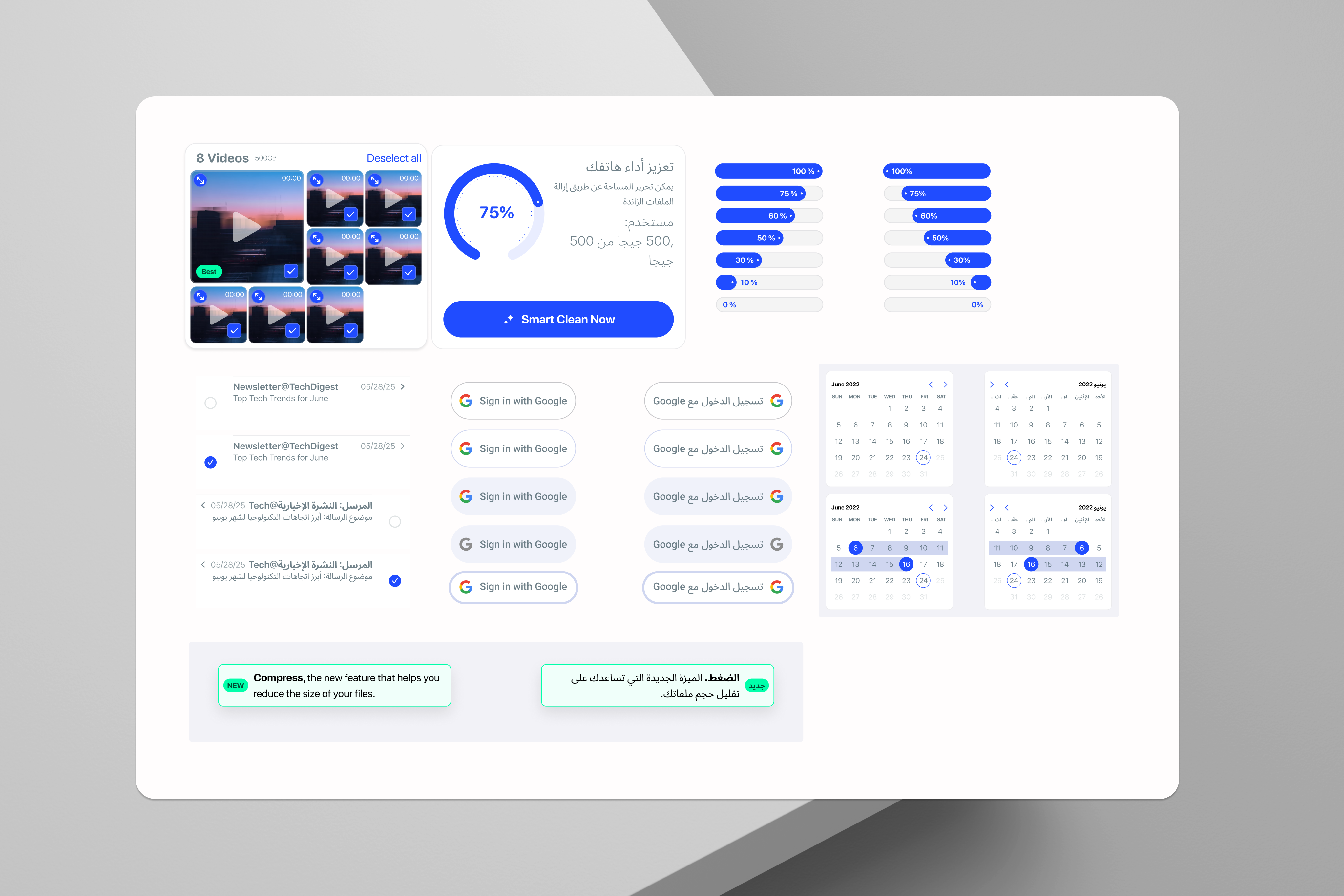
The Arabic variant required higher information density, different social proof patterns, Mada and STC Pay payment entry points, right-to-left layouts, and a distinct visual trust hierarchy. The temptation was to build it as a separate product. Instead, we built it as a configuration of the same component system, a single token layer with market-specific overrides for density, typography scale, and payment UI.

Why this mattered strategically: Two parallel products would have doubled maintenance costs and halved the team's ability to ship features consistently. The one-system approach meant a bug fixed in the US variant was fixed in the Arabic variant simultaneously, and a new component built for the US was already 80% of the way to the Arabic variant. This DesignOps decision was as much a business decision as a design one.
Before/after onboarding flow comparison
Original 7-step onboarding vs redesigned 2-step flow, demo scan first, permissions at the moment of intent, immediate results.
05

One system. Two markets. 120+ components.

The design system had to solve a structural problem: serve users with fundamentally different expectations of what "a trustworthy utility app" looks like, without creating two parallel maintenance burdens. The solution was a single token layer with market-specific configurations, not two design systems.

Figma · Variables
Token layer
Single source of truth for color, spacing, typography, and radius. Market overrides applied at the token level, not the component level.
→
Figma · Auto Layout
120+ components
All components built with Auto Layout and density variants. US default: comfortable spacing. Arabic variant: compact, information-dense configurations.
→
Figma AI · Annotation
Handoff + DesignOps
Figma AI used to accelerate annotation and spec generation. Reduced design-to-dev handoff time by 30%, freeing the team for higher-value work.
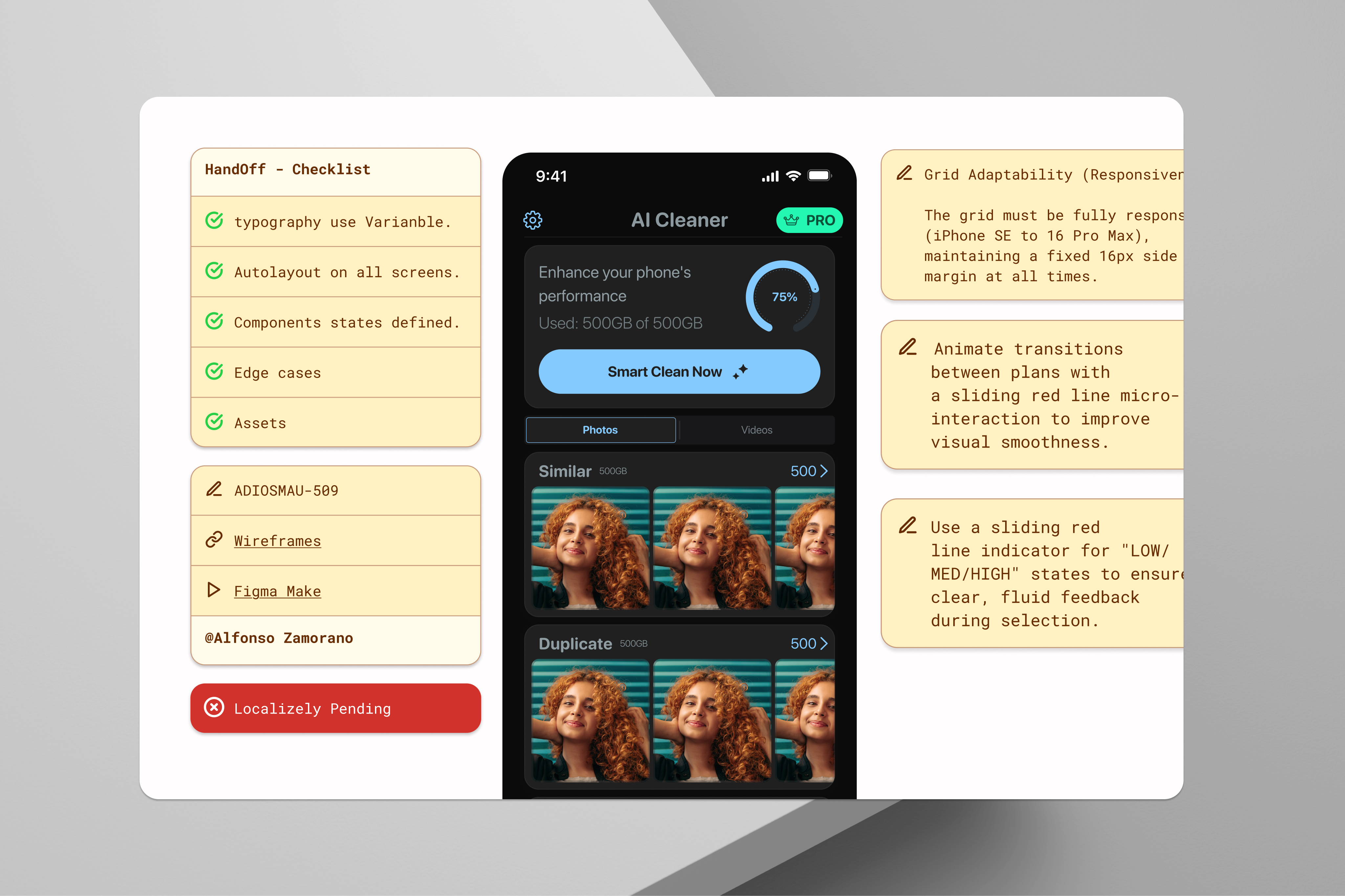
AI Cleaner design system, component library and dual-market variants
120+ components built from a single token layer, US and Arabic density variants configured at the token level, not duplicated at the component level.

Business read: the 30% reduction in design-to-dev time isn't a design-team vanity metric, it's engineering hours not spent on rebuild, redirected to shipping.

06

We tested before we built. Every time.

With a team of three and engineering bandwidth always at a premium, we couldn't afford to build features that failed in testing. Every major decision went through at least one validation round before a single line of code was written.

Maze · Unmoderated testing
Permissions flow A/B
80 participants tested the demo-first onboarding against a redesigned traditional permissions screen. Two variations, same sample cohort, measured on permissions grant rate and time-to-first-scan.
Outcome: Demo-first variant achieved 2.1x higher permissions grant rate. Decision confirmed before any engineering work began.
Amplitude · Post-launch
Funnel tracking at every step
After launch, we instrumented every screen transition in the new flow. The 31% secondary drop-off (post-permissions, pre-scan-completion) was tracked weekly and drove two additional iterations on the results screen CTA hierarchy.
Outcome: Secondary drop-off reduced from 31% to under 8% over 6 weeks post-launch.
Synthetic Users · Market validation
Arabic variant concept testing
Before investing engineering time in the market-specific payment integrations and density variants, we ran concept validation with Synthetic Users, AI-simulated Arabic market personas, to pressure-test the information hierarchy and trust signal placement.
Outcome: Identified two trust signal placements that were counterintuitive for Arabic users, corrected before prototype build.
App Store · Qualitative reviews
Post-launch sentiment analysis
We tracked App Store review sentiment weekly in both markets post-launch, using a structured tagging system to identify recurring UX friction patterns. This became an ongoing input into the sprint planning process, not a one-off post-launch check.
Outcome: Review sentiment identified the storage recovered metric as the most motivating element, surfaced it more prominently in v1.1.
07

Quarter post-launch.

Within 120 days of launch, every key metric had moved. The trust-first onboarding didn't just fix activation, it changed the entire shape of the user relationship with the app.

4.6★
App Store rating
Top 10 in the Utilities category at launch, and 4.6★ from 210K ratings today. The ranking has since slipped to #172 in the US store. The rating reflected not just the product but the quality of the first-session experience.
Pre-launch: N/A → 4.6★ today
2.5GB
Storage recovered per user
Average storage recovered per first session: 2.5GB, up from 340MB with the previous 7-step flow. The simplified scan-to-clean path removed the friction that was causing users to stop before completing their cleanup.
340MB → 2.5GB avg
+30%
Design-to-dev delivery speed
Faster cycles enabled by the design system and Figma AI-assisted annotation. The one-system approach meant that every component built once served both markets, no duplicated handoff work.
+25%
Team sprint velocity
Increase in output per sprint, measured against the 6-month pre-system baseline. DesignOps investment paid off in engineering confidence and design consistency, fewer revision cycles, faster builds.
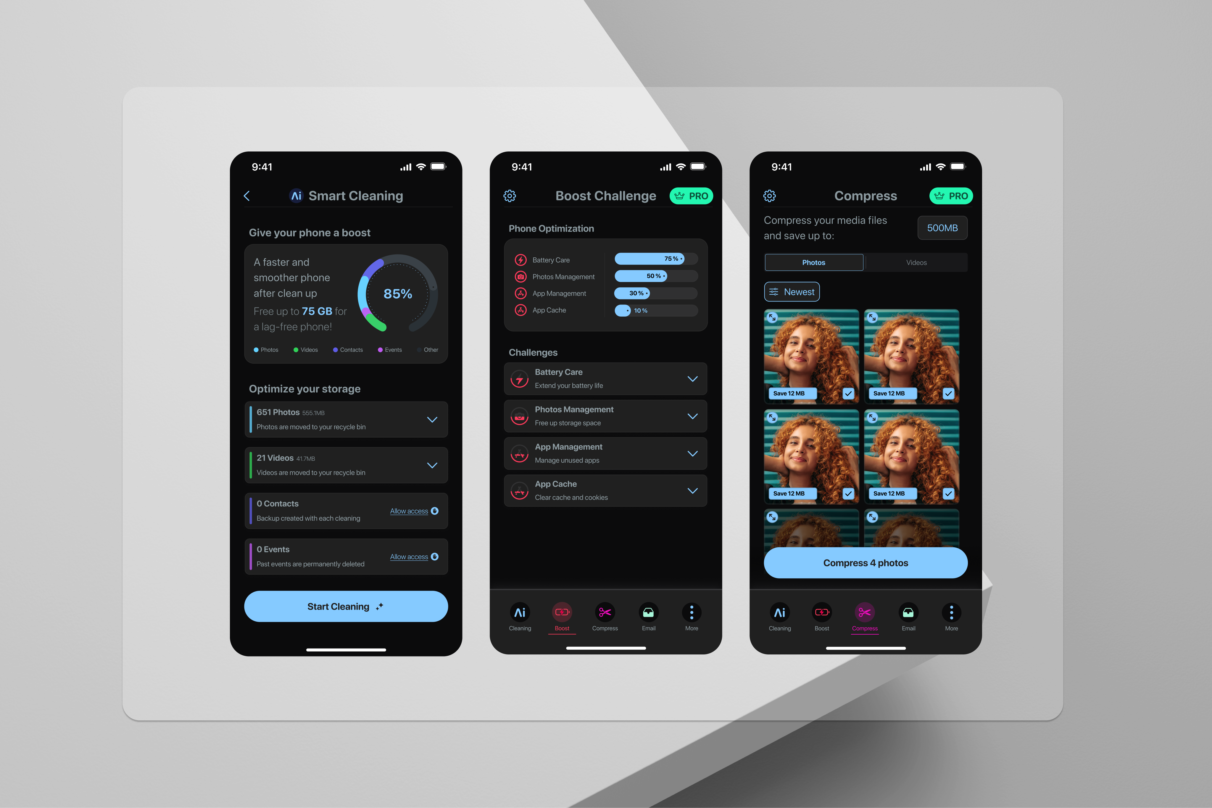
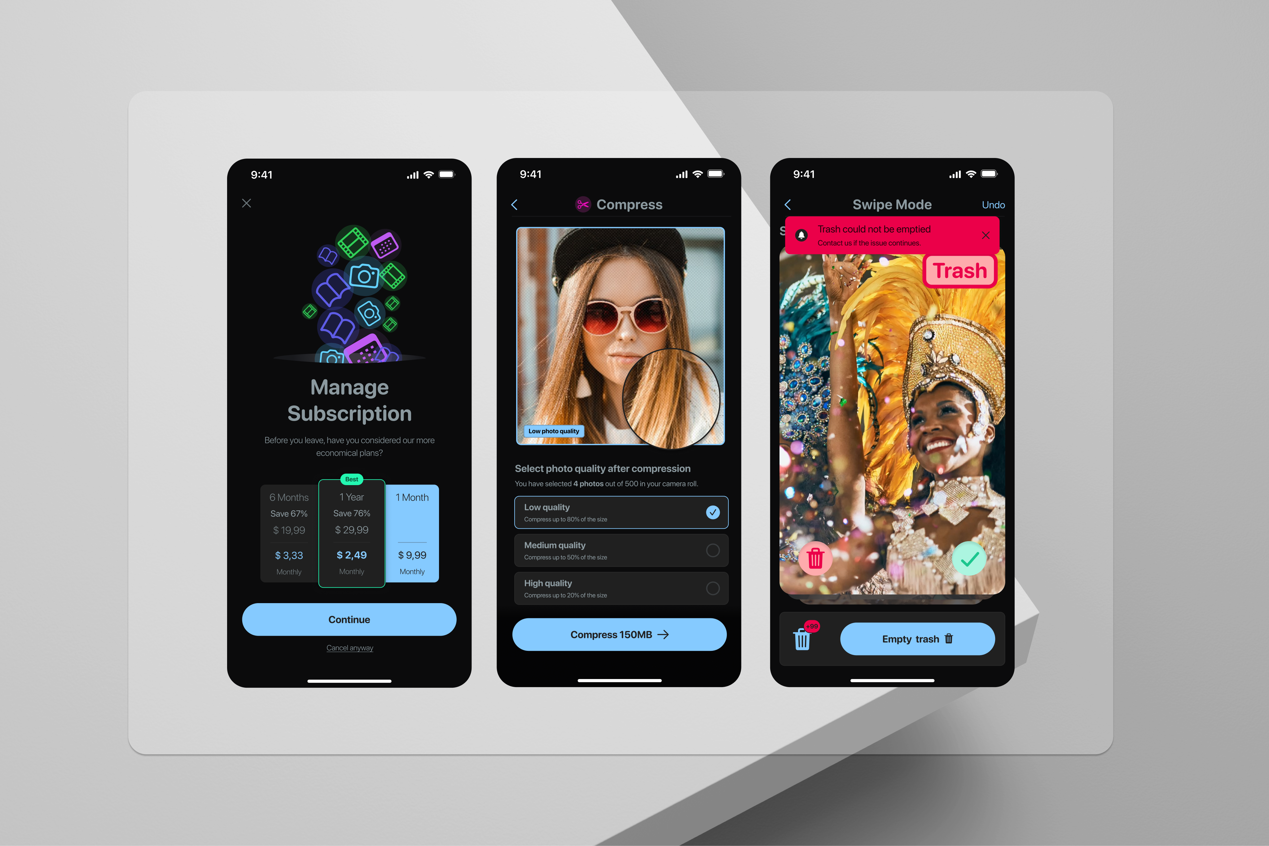
AI Cleaner final product screens
Final product across the core flow: demo scan, contextual permissions ask, and one-tap clean results screen.
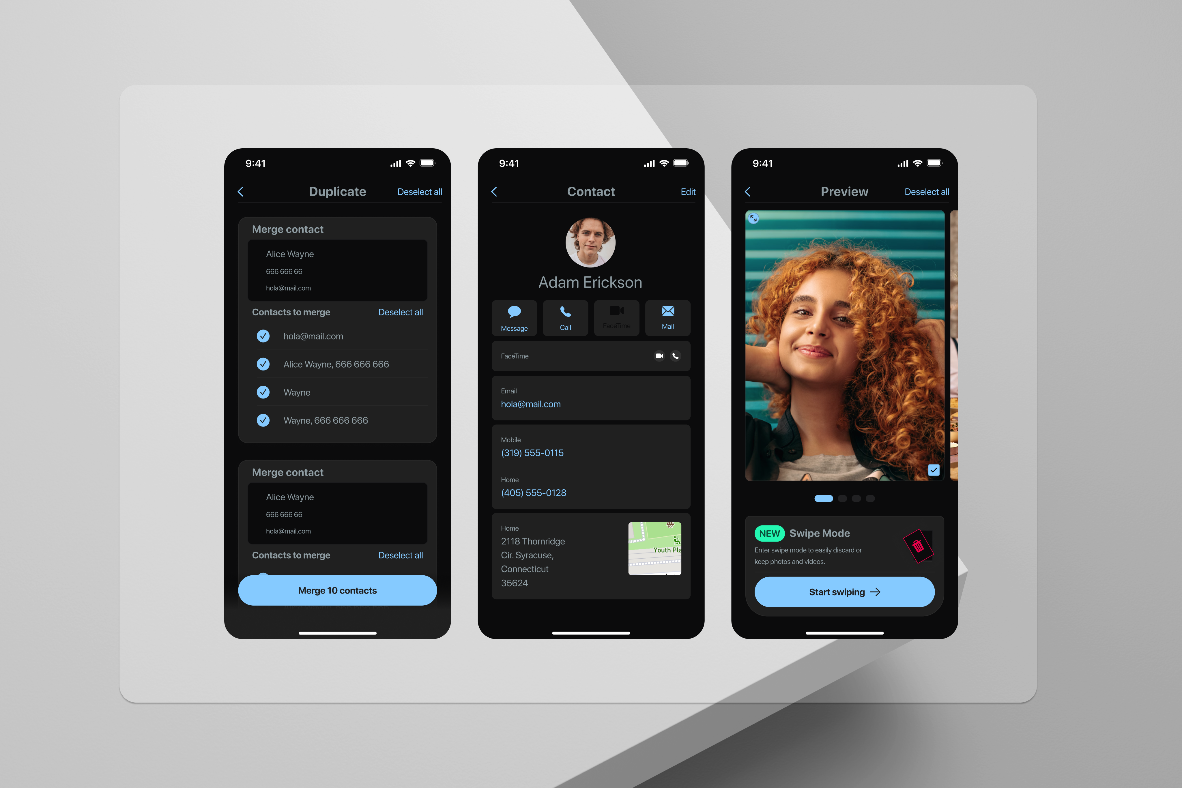
AI Cleaner additional screens
08

What I'd do differently.

01

I'd instrument the demo scan earlier

The demo scan was our most effective onboarding intervention, but we didn't have robust analytics on it until two months after launch. We knew it was working from the permissions grant rate, but we didn't understand which elements of the demo were driving conviction, the file type categories, the storage number, or the animation. Earlier instrumentation would have let us optimise the demo faster and with more confidence.

02

The Arabic variant deserved its own discovery sprint

We validated the Arabic concepts with Synthetic Users, which was faster than in-person research but came with a ceiling on fidelity. The two trust signal corrections we made pre-launch were caught by that process, but I suspect there were subtler issues we missed, particularly around the post-scan flow and the way results are communicated. A dedicated round of research with real users in Arabic countries would have given us the confidence to ship the Arabic variant with fewer post-launch question marks.

03

What changed since

The business case for Decision 03 used to live only here, as a lesson learned after the fact. It's now the first thing you read in that decision above, because a case study that flags its own blind spot and then fixes it is more useful than one that just lists the fix as a regret.

The 67% drop-off wasn't a design problem. It was a strategy problem, we were asking for trust before we'd earned it. Once we named that clearly, the right decisions followed.

Building for two markets from one system wasn't the easy path. But it was the right one, and it's the kind of decision that only looks obvious in retrospect.

← All case studies